
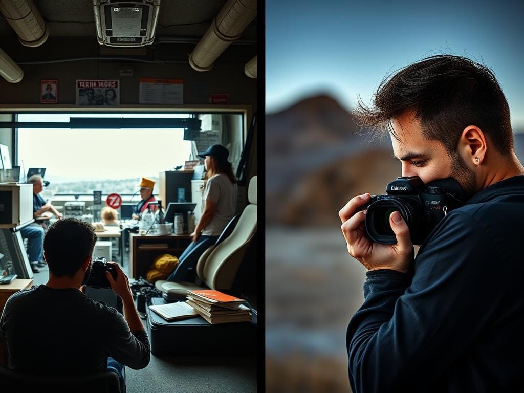
Your photos might look good but feel off. They might look messy or not professional. The problem isn’t your camera; it’s how you compose your shots.
In this short section, you’ll learn about common mistakes. You’ll get tips to spot these mistakes quickly. And you’ll discover three easy habits to improve your photos right away.
Key Takeaways
- Many beginners make the same composition mistakes. Spotting these can help you fix them faster.
- Good photography tips include checking your edges and simplifying the scene. Make sure your subject is clear.
- Instead of zooming, move closer to your subject. Try different focal lengths to find better framing.
- Start framing your photo with purpose. Use cropping to enhance, not fix, your shots.
- Practice by taking photos locally. Slow down and edit your photos to show your unique style.
Common composition mistakes beginner photographers make
Beginners look for clear advice. Using the exact phrase helps people find practical help fast. It shows this piece is a hands-on checklist.
Here are common issues seen in portfolio reviews and online critiques. Each item links to focused practice. This helps photographers spend time on the right skills instead of random shooting.
Frequent composition errors seen most often:
- Crooked horizons that steal perceived professionalism.
- Poor edge control where unwanted subjects touch the frame.
- Subjects placed too small or absent, leaving images without a focal point.
- Overreliance on a single orientation or focal length, creating predictable shots.
- Unrealistic color saturation from weak color management and bad post work.
- Soft or inconsistent sharpness due to wrong shutter speed, back-focus, or camera shake.
- Poor contrast and exposure that flatten mood and reduce print quality.
- Heavy-handed HDR or bracketing used without intention.
- Too many undeveloped images and no consistent body of work.
- Impatience: not simplifying scenes or trying alternative compositions.
Knowing these common composition errors speeds learning. When you know the shortlist, practice becomes surgical.
Use targeted drills: straighten horizons, tighten edge control, move closer to subjects, vary focal lengths, switch orientations, and limit saturation boosts. These photography composition tips create a shorter learning curve and clearer progress.
| Frequent Error | Why It Happens | Quick Practice Drill |
|---|---|---|
| Crooked horizon | Rushed framing, no horizon reference in viewfinder | Shoot 20 landscapes, check horizon with grid, correct in-camera |
| Poor edge control | Failure to scan frame borders before release | Frame-proofing: rotate viewfinder to inspect all edges |
| No clear subject | Overcomplicated scenes, lack of prioritization | Create a single focal point using foreground interest or negative space |
| Single orientation/focal length | Comfort with default lens and habit | Shoot the same scene in portrait and landscape and with 3 focal lengths |
| Unrealistic color saturation | Poor color management and heavy-handed edits | Calibrate monitor, compare RAW to edited JPG at low saturation |
| Soft or inconsistent sharpness | Wrong shutter speed, focus errors, or camera shake | Use a 1/2x focal-length shutter rule, recheck AF point on eyes |
| Flat exposure/contrast | Reliance on auto exposure and aggressive shadow lifting | Bracket critical highlights, learn to place black and white points |
| Overdone HDR | Belief that more dynamic range always improves images | Limit HDR to high-contrast scenes; use subtle blending |
| Inconsistent portfolio | No editing discipline or clear visual voice | Curate weekly, publish only your best 10 of 50 |
| Impatience in the field | Not exploring variations or waiting for better light | Take 3 more frames with changes in angle, distance, and light |
Crooked horizons and off-kilter frames that undermine professionalism
A tilted horizon can make a photo look amateur. Small tilts might not show on a screen but are clear in prints. Shooting with a lean too often makes people think you’re not skilled.
How slight skews affect perceived quality and printing
A small tilt can pull your eye away from the main subject. It creates tension that doesn’t help the photo. Prints make this imbalance even more obvious, turning a small issue into a big flaw.
Prints are noticed for uneven horizons before anything else. People see these flaws before they talk about colors or sharpness.
Viewfinder habits: finding a fixed reference to straighten shots
Train your eye to use fixed points in the scene. Look for things like lamp posts, tree trunks, or buildings. Use the in-camera grid or horizon guide to keep lines straight.
Practical fixes in-camera and in post (crop/rotate tips)
Use an electronic level or a bubble level on your tripod. Take several shots while adjusting your position. If a tilt shows, rotate and crop in editing software to fix it.
Avoid extreme rotation that leads to bad crops. Check the edges after straightening to make sure nothing important is lost.
Simple habits lead to better photos. With practice, you can straighten horizons and frame photos better. These tips help your photos look intentional and professional.
Poor edge control and why the frame’s borders matter
Edges are like invisible gates that keep our eyes inside a photo. Good edge control stops our eyes from wandering. It turns a simple shot into a strong statement.
Edges help guide our view. A dark tree trunk or a ray of light near a border can anchor the scene. A part of an object at the corner can add tension without losing balance.
Remove things that pull our eyes out of the photo. Limbs, poles, bright spots, and reflections near the edges can distract. Move a bit, change your angle, or wait for the right moment to clean up the frame borders.
Crop with a story in mind. A tight crop makes emotions stronger and focus clearer. A wider crop adds context and setting. Each crop changes the story and balance of elements.
Practice framing in-camera instead of fixing it later. Try different focal lengths and move around to simplify scenes at the edges. This habit helps you see what belongs inside the frame and what doesn’t.
| Edge Strategy | When to Use | Effect on Image |
|---|---|---|
| Deliberate anchors at borders | Portraits and structured landscapes | Holds the viewer’s eye, adds depth |
| Remove stray highlights or poles | Busy urban scenes | Reduces distraction, clarifies subject |
| Tight crop | Emotional or detail-focused shots | Intensifies subject, limits context |
| Wider framing | Environmental portraits, landscapes | Shows setting, risks clutter at frame borders |
| Change position instead of cropping | Field work, unpredictable scenes | Improves composition, fosters better photo framing |
Remember these tips when you take photos. Small changes and careful choices at the edges make photos clearer and more meaningful. Strong edge control leads to images that grab our attention and tell clearer stories.
Not being close enough: the cost of shooting from too far away
Beginners often think being far away is good. But it makes pictures less powerful and less emotional. Robert Capa said, “If your pictures aren’t good enough, you’re not close enough.”
Robert Capa’s advice and why proximity increases impact
Getting closer makes things bigger in the picture. Faces show more feelings. Textures are clearer. You feel like you’re right there.
Move in to catch the best moments. Capa’s rule means getting close for better stories. This often makes pictures more memorable.
When to use wide-angle vs standard focal lengths to avoid distortion
Wide lenses can make edges look wrong and faces look odd if subjects are near the edge. Use a wide lens on purpose for certain stories.
For most close shots, choose a standard lens like 35-50mm. Move back a bit and zoom instead of using a wide lens. This keeps things looking natural and subjects clear.
Practical in-field exercises to get comfortable moving closer
- Zoom-with-your-feet drill: shoot a scene at 24mm, then back up and reframe at 35-50mm. Compare results for distortion and impact.
- Close-quarter portrait practice: spend a session working 2-6 feet from a model or friend. Focus on eyes and expressions.
- Fill-the-frame challenge: pick five subjects and take one image that fills the frame completely for each. Review what worked.
Start thinking like a get closer photographer. It changes your habits and improves your photos fast. Keep track of your progress by comparing old and new photos. See how close you are now.
Weak subject placement and images with no clear subject
Many photos feel empty because the subject gets lost in clutter. First, decide what’s most important in a scene. It could be a person, a patch of light, or a bold color.
In busy places, learn to find the main subject fast. Look for the strongest shape, highest contrast, or most saturated color. Use size, sharpness, and tonal contrast to make one element stand out.
How to identify and prioritise one element
Ask if every element adds to the story. If not, change your distance or angle. Move closer, zoom, or shift your viewpoint until the main subject is clear.
Balancing emotion and visual anchors
Mix form and content by pairing emotional intent with clear anchors. Let a subject’s expression or gesture carry the emotion. Use a compositional device to hold the eye. This makes ordinary shots communicate.
Compositional tools to make subjects stand out
Use leading lines to guide the eye. Place subjects inside doorways, windows, or archways for natural frames. Leave negative space around the subject to isolate it and emphasize mood.
Try different focal lengths and viewpoints to test presence. A longer lens can compress a distracting background. A lower angle can empower a subject. For more tips, see this guide from Digital Photography School: common beginner mistakes.
Apply simple photography composition tips each shoot. Prioritize the strongest visual element, remove irrelevant details, and commit to a single subject before pressing the shutter.
Overreliance on one orientation or focal length (creative laziness)
Many beginners only shoot in portrait or landscape. This is often because it’s easy, not because they want to. Trying different ways to frame a scene opens up more creative options.

Practicing with different orientations brings new views. Try changing orientation in the middle of a shoot. This simple change can make your photos better and tell a clearer story.
Why alternating portrait and landscape matters
Each subject needs its own frame. A tall subject looks cramped in landscape. Wide scenes lose context in portrait. Using both prepares you for different needs and platforms.
Changing orientation also shows hidden strengths in your photos. Lines and empty space look different in different frames. This affects mood and impact.
How ‘zoom with your feet’ and changing orientation reveal better compositions
Move around instead of using the zoom. This changes perspective and focus. It often makes photos clearer and less cluttered.
Combine moving with changing orientation. Step closer, then shoot portrait. Back up, then switch to landscape. Each choice offers new ways to frame your photo.
Field tests to break default shooting habits
Do short, repeatable drills to force variety. Photograph the same person or object in both orientations and three focal lengths. Note the differences.
Try an hour where you force the opposite orientation of your instinct. Do a five-position test: shoot from five heights or angles around the subject. These exercises help you make better composition choices.
| Exercise | Steps | Objective |
|---|---|---|
| One-subject, dual-orientation | Photograph subject in portrait and landscape at 35mm, 50mm, 85mm | Compare framing, background compression, and subject emphasis |
| Opposite-hour | For one hour use only the opposite orientation you prefer | Break default habits and force new composition decisions |
| Five-position test | Shoot from five heights and angles around the same subject | Explore perspective changes and improve better photo framing |
| Zoom-with-your-feet drill | Move physically closer and farther instead of changing lens | Train perspective control and deepen understanding of scale |
| Review session | Cull and rate images after each exercise against composition rules | Reinforce learning and collect practical photography composition tips |
Excessive saturation, unrealistic colors, and poor color management
Color is very important in photos. If colors seem too bright, people might think the photo is fake. Choosing the right colors helps keep the focus on the main subject.
The monitor problem
Having a calibrated monitor is key for editing. Different screens from Dell, Apple, and ASUS show colors differently. Without proper color management, your edits might look wrong on other screens or in prints.
Use tools from X-Rite or Datacolor to calibrate your monitor. Always set a consistent white balance in your work. Calibrate before big edits and check your work on different devices to avoid surprises.
When to boost saturation and when to preserve natural tone
Increasing saturation can make a dull scene better. But too much can look amateurish. Prints often show colors more strongly than screens, so edit with care for both.
Look for scenes with already bright colors, like a subject against a dull background. The golden hour light makes colors pop without needing to adjust much. Only use big saturation changes for special effects, not for every photo.
Alternatives to crude saturation increases
Targeted adjustments give you more control than just using a slider. Try selective color changes, split toning, and layer-based color overlays for a unique look without losing realism.
Try adding a warm overlay to highlights or lowering saturation in the background to highlight a subject. These techniques keep skin tones accurate and help frame photos better than just increasing saturation.
For more tips on color and editing, check out this guide from Digital Photography School: 10 common mistakes made by new photographers.
Soft or inconsistent sharpness that distracts from composition
Soft sharpness can ruin a great photo. On purpose, blur can be cool. But, by accident, it takes away from your main subject. This guide will help you keep your photos sharp.
Focus strategies for portraits
For portraits, focus on the subject’s eyes. Make sure the eyes are the sharpest part. Use a single AF point or eye-detection AF on Sony, Canon, or Nikon.
When the depth of field is shallow, step back. Increase the focal length or stop down the lens. This keeps the eyes sharp and the background nice.
Shutter speed rules, crop factors, and ISO
Use a shutter speed of at least 1 divided by focal length to avoid shake. For a 50mm lens, aim for 1/50s. APS-C cameras need a faster shutter speed because of the crop factor.
For moving subjects, use around 1/320s to freeze them. When it’s dark, raise the ISO to keep the shutter speed. Modern sensors handle high ISOs well.
Back-focus problems, stabilization, and tripod use
Back-focus happens when the camera focuses behind your subject. Calibrate lenses or use microadjustment. Use single-point AF for critical focus.
IBIS on mirrorless cameras lets you handhold at slower speeds. But, a tripod is key for long exposures and precise framing. Choose a sturdy tripod from Manfrotto or Gitzo.
| Issue | Quick Fix | When to Use |
|---|---|---|
| Soft focus on eyes | Single AF point, eye-detection AF, stop down 1-2 stops | Portraits, tight headshots |
| Camera shake | Shutter speed ≥ 1/focal length, IBIS, tripod | Low light, telephoto, long exposures |
| Motion blur of subject | Increase shutter speed to ~1/320s, raise ISO | Moving people, sports, street |
| Back-focus | Lens calibration, single-point AF, manual focus check | Critical sharpness, portraits, studio work |
| Depth of field too thin | Use smaller aperture, step back, choose longer lens | Group portraits, full-body shots |
These tips are easy to follow and will improve your photos. Focus on your subject, use the right shutter speed, and choose the right stabilization. Your photos will look better with each try.
Poor contrast, exposure, and tonal control that flatten images
Good tonal control shapes mood and quality. Think of contrast control as a tone dial. It can sharpen or wash out an atmosphere.
Lighting and subject matter decide contrast, not presets. This is important for a good picture.

Getting exposure right in-camera saves time and detail. Use the histogram to spot clipping. This helps avoid heavy editing later.
True black and white points anchor an image. Adjust levels to guide the eye. Preserve detail in shadows and highlights when needed.
Bracketing is good when the histogram shows clipping. Learn to read your camera’s meter and histogram. This trains your eye and speeds up decision making.
Small in-camera choices make a big difference. Lower ISO for cleaner tones. Expose to protect highlights in backlit scenes. Dial contrast down for high dynamic range scenes.
These tips build stronger raws to work with.
Below is a quick reference to compare common tonal approaches and when to use them in practice.
| Scenario | In-camera move | Post approach | Why it works |
|---|---|---|---|
| Bright backlight | Expose for highlights; use +EV if subject in shadow | Recover shadows, add selective contrast | Protects highlights while keeping subject detail |
| Flat overcast light | Increase contrast subtly and lower ISO | Boost midtone contrast, adjust black and white levels | Restores depth without introducing noise |
| High dynamic range scene | Bracket when histogram shows clipping | Blend exposures or use local adjustments | Preserves both highlights and shadow texture |
| High-key portrait | Expose for skin tones; avoid clipping eyes | Raise blacks slightly, keep whites clean | Maintains flattering tones and contrast control |
| Low-key mood shot | Underexpose a touch to hold highlights | Deepen blacks, protect midtones | Enhances mood while preserving necessary detail |
Heavy-handed HDR and bracketing habits used without purpose
HDR can save a scene with lots of contrast. But using it too much can make images look flat. It’s important to keep edits simple to keep the natural look and feel.
Start by checking the histogram. If highlights or shadows are too bright or dark, bracketing is a good idea. But if the image looks good, you might not need to bracket at all.
When HDR helps and when it harms realism:
- Use HDR for scenes with extreme contrast, like sunset cityscapes that lose detail in shadows.
- Avoid HDR for low-contrast portraits where natural skin tones and subtle shadows matter.
- Aim for subtle tone blending that restores dynamic range without erasing natural shadows.
Identifying the fine line between useful dynamic-range work and over-processing:
- Compare the HDR result to a well-exposed single capture. If the image looks painted, dial back strength.
- Retain some deep blacks and highlights to keep three-dimensional form.
- Work with local adjustments, not global boosts, when you need detail in specific areas.
Smart bracketing habits: check histograms first, don’t bracket everything.
- Bracket selectively for sunrise, interiors with bright windows, or scenes with reflective water.
- Set modest exposure steps: 1 to 2 stops often cover the needed dynamic range without excess frames.
- Use bracketing to protect highlights or shadow detail, not to create an all-purpose fix for composition issues.
Photography composition tips tie into exposure choices. A well-composed frame that respects light needs less heavy postwork. Compose to protect highlights and place subjects where natural contrast supports shape and depth.
Inconsistent body of work and too many undeveloped shots
Too many images can make your work less impactful. A well-chosen few can make a bigger statement. It’s important to accept that editing is part of the process.
The value of editing down: quality over quantity
Pick images that clearly show an idea or feeling. Remove images that are too similar or not good enough. Each image should be a promise to the viewer, promising something even better next.
Creating consistent series and visual voice for galleries or portfolios
Organize images by theme, color, or mood to create a cohesive look. A series that feels intentional shows your visual style. Taking photos regularly helps you develop a style over time.
Practical workflow tips for regular editing and curation
Set aside time each week to edit and organize. Use tools like Lightroom Classic or Capture One to mark favorites and remove duplicates. Star your best images for portfolios and move others to a separate folder.
| Task | Frequency | Tool | Benefit |
|---|---|---|---|
| Quick cull | Weekly, 20 minutes | Lightroom Classic | Prevents catalog bloat and keeps focus |
| Developed edit | Monthly | Capture One or Lightroom | Creates consistent look for galleries |
| Portfolio refresh | Quarterly | Local backup + cloud | Shows growth and removes weak work |
| Archive maintenance | Annually | External drive with checksums | Reduces duplicates and frees storage |
When reviewing images, use photography composition tips. These tips help you decide which images tell a story and which don’t. For beginners, editing regularly is key to a strong, consistent portfolio.
Impatience in the field: rushing composition and missing better options
Being impatient in photography can really hurt your shots. Many new photographers rush through, taking a few pictures and then moving on. They treat it like a task list.
But, if you slow down, you’ll find better shots. Look for things to anchor your frame. Try different angles and lengths before you leave. This way, you get stronger light and quieter backgrounds.
Before you leave, try a few simple things. Change how you hold your camera, get closer, or climb up. These small changes can make a big difference in your photos.
Take many pictures. Zoom in and out, and move back and forth. You’ll find the best shot for your story.
Use a simple checklist to help you. Check your horizon, fill the frame, and find things to anchor your shot. Try different angles and review your photos. This helps you get better fast.
Remember, patience and trying again are key. Not rushing. Sources: Squarespace, Canon, Sigma, Adobe, DxO, Topaz Labs.
Stay focused,
Ray Baker.