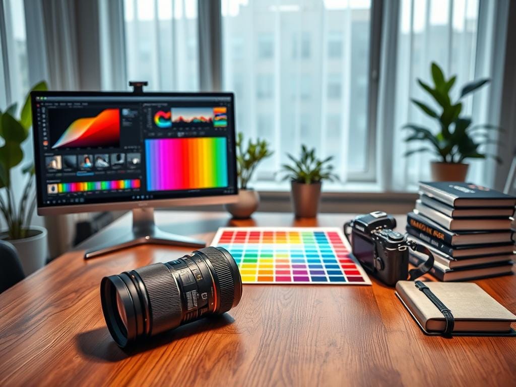
Are you upset when photos look different on your screen than they do in print? The solution is simple. Start with a high-resolution file and make it ready for the print size and lab you choose.
It takes less than five minutes to make sure your prints look great. First, set the file to 300 DPI and the exact print size. Or, use a lower DPI for big prints. Then, change the color space to sRGB for most labs.
Next, sharpen the image for the final print size. And, export it as a high-quality JPEG, TIFF, or PDF. These steps help keep your photos sharp and vibrant.
Key Takeaways
- Always deliver full-resolution files when possible to preserve resolution for prints.
- Check DPI at the final dimensions—300 DPI is the default for small to medium prints.
- Use sRGB for most consumer labs; embed custom profiles only when the lab requests them.
- Sharpen at final size and choose settings for the output medium (glossy, matte, canvas).
- Export as high-quality JPEG (Lightroom ≥85%) or TIFF/PDF for best photography print quality.
Why prints go from gorgeous on screen to cheap on paper
A bright photo on an Apple MacBook or a Samsung Galaxy can look perfect. But, it might print poorly. Many photographers miss the technical gap between devices and presses.
Small file size, wrong resolution, and hidden compression change how detail and color translate to paper.
Start with the core difference: screens use pixels per inch while printers use dots per inch. This difference explains why prints look bad when people expect screen quality to carry over.
Difference between screen PPI and print DPI
Screen PPI measures how many pixels appear across an inch of a display. Typical laptops show 72–96 PPI. High-end Retina and 4K panels pack more pixels but rely on light emission.
Print DPI counts individual ink or toner dots a printer places on paper. The common rule of thumb for close viewing is 300 DPI.
One way to think about it: moving from 72 PPI to 300 DPI needs roughly four times more pixel information. That explains why a photo that looks sharp on a monitor can appear soft, pixelated, or grainy once printed.
How viewing distance changes required resolution
Viewing distance alters the DPI you need. Handheld prints, books, and gallery prints meant for close inspection demand high resolution around 300 DPI. Large posters and billboards are viewed from far away and can use 150–200 DPI, or even 72–100 DPI for massive banners.
Use viewing distance to accept lower resolution for large-format work. A city poster viewed from 10 feet needs much less detail than a 8×10 print meant for a desk or wall near eye level.
Common pitfalls: social media compression and resaving
Social networks and messaging apps compress images to save bandwidth. Facebook, Instagram, and WhatsApp often strip detail and reduce color fidelity. Downloading and re-saving those files compounds artifacts.
Repeating JPEG saves progressively degrade sharpness and introduce blocky noise. Enlarging a compressed file forces interpolation routines in Photoshop or Lightroom to invent pixels. Smart upscaling helps, but it cannot recreate original detail. When possible, work from the camera’s original RAW or a high-resolution TIFF to avoid these problems.
| Use case | Typical required resolution | Why it matters |
|---|---|---|
| Handheld prints, photo books | 300 DPI | Close inspection shows flaws; needs full detail |
| Posters and gallery prints (viewed at arm’s length) | 150–200 DPI | Balanced detail and file size for medium distances |
| Large banners and billboards | 72–100 DPI | Viewed from far away; lower DPI saves workflow time |
| Files from social apps | Often under 1000 px on long side | Compression and resaving make them unsuitable for quality prints |
print ready photo settings
To get prints that look like your screen, use simple settings. Pixel math and DPI targets help. Add a small safety margin for sharp edges after trimming.
Choosing the right DPI is key. For 300 DPI, divide pixels by 300 to find the inch size. For example, 4032 pixels equals 13.44 inches at 300 DPI.
Leave 5–10% extra space for cropping or sharpening. This ensures your prints look sharp.
Match your print size before exporting. Use camera pixels when you can. Photoshop and Adobe Camera Raw help with resizing, but avoid big enlargements.
Plan your pixel dimensions for 300 DPI prints. Here are some common sizes to check before sending to a lab.
| Print Size (in) | Pixel Dimensions at 300 DPI | Max Long Side at 300 DPI (in) |
|---|---|---|
| 4 × 6 | 1200 × 1800 px | 6.00 |
| 5 × 7 | 1500 × 2100 px | 7.00 |
| 8 × 10 | 2400 × 3000 px | 10.00 |
| 11 × 14 | 3300 × 4200 px | 14.00 |
| 16 × 20 | 4800 × 6000 px | 20.00 |
Use this table for quick checks. Set your image size and DPI in the export dialog. Apply sharpening for the best look.
Large prints need different settings. Posters and banners are seen from far away. Use 150–200 DPI for medium posters.
Test large prints at viewing distance. A 24 × 36 poster at 150 DPI looks sharp from a few feet away. This balances size, cost, and sharpness.
Keep metadata and original files until you’re sure. Make small changes and check at full size. This saves money and keeps clients happy.
Color management and color space for consistent print quality
Getting color right for print starts with clear color management and the right export choices. Small mistakes in profile handling or export can turn a vibrant file into a dull or muddy print. Use a simple workflow that ties monitor calibration, color space choice, and photo export settings for print into one repeatable routine.
Why sRGB is safest for consumer labs
Most consumer labs and many online print services expect files in sRGB for print. Delivering files in wider spaces like Adobe RGB or ProPhoto without conversion can cause unexpected shifts when the lab flattens colors. For quick client orders and standard papers, export to sRGB for print to avoid surprises.
When to use or embed custom printer profiles
Pro labs such as Miller’s Professional Imaging and Mpix offer ICC profiles for their papers and processes. Request the lab’s profile, soft-proof your image in Photoshop, then embed that profile when exporting. Embedding profiles matters when a lab asks for them or when you use specialty papers and presses.
Monitor calibration best practices
Calibrate your monitor regularly with hardware like Datacolor Spyder or X-Rite i1Display. Let the screen warm up 20–30 minutes before color work. Use a monitor hood to cut glare and set ambient lighting consistent with your print-viewing environment.
Keep a short checklist: calibrate, soft-proof with the lab profile when available, and finalize photo export settings for print using the lab’s requirements. Photographers who print often build trusted relationships with labs and include clear print instructions in client guides to reduce color mismatch and reprints.
File formats, JPEG quality and export options that keep detail
Choosing the right container for final images prevents soft prints and ugly artifacts. Use lossless files for edits and a single, well-exported delivery file for client prints. Clear file naming and an embedded profile stop mix-ups between web and print versions.
Pick the format that matches the job. TIFF delivers the least compression and the most headroom for retouching. A print-ready PDF is best when you must include bleed, crop marks, or type. A high-quality JPEG works when clients need smaller files without a huge quality hit.
Choosing between TIFF, high-quality JPEG, and PDF
Save masters as TIFF or PSD to preserve layers and full tonal range. When sending proofs or final images for consumer labs, export one high-quality JPEG for prints to balance size and fidelity.
For magazine or press work, create a print-ready PDF with CMYK conversion and a standard bleed of 1/8 inch. Embed fonts and include crop marks when a commercial press requests packaged files.
Export settings to avoid compression artifacts
In Lightroom, set export quality at or above 85%. In Photoshop use quality 10–12 or 100% when the dialog provides a 0–12 or 0–100 scale. Avoid saving the same JPEG repeatedly; keep a TIFF master and export a fresh high-quality JPEG for prints.
Name files so clients and labs can spot the right version: image-name_PRINT.jpg versus image-name_WEB.jpg. Check the embedded color profile before sending and confirm metadata matches the intended output.
Keep a short checklist: master format, delivered format, embedded profile, bleed and marks for PDFs, and final photo export settings for print. That routine preserves edge detail and color accuracy across different labs and substrates.
Aspect ratio, cropping strategy and safe framing for client prints
Make a simple plan for crops. This way, clients always get the same quality. Use common aspect ratios to make files flexible for labs and galleries.
A clear cropping strategy saves time. It also keeps the image’s composition the same when it goes from screen to paper.
Crop to ratios that photographers and labs expect. Native camera ratios like 2:3 work well for many prints. Portrait clients and wedding albums often favor 4:5.
Delivering files cropped to an 11:15 ratio is a good middle ground. This way, prints between 2:3 and 4:5 need only minor adjustment.
Shoot with extra space around subjects. Leave extra headroom and side space. This way, people are not cut off when a client requests a different crop.
Wrapped canvases need more edge material. This is so they can wrap around stretcher bars without losing key elements.
Make a short visual guide for clients. Show how different crops affect framing. Include side-by-side examples of 2:3, 4:5, and 11:15 crops.
This way, buyers see the trade-offs before ordering. It improves trust in your cropping strategy and raises perceived photography print quality.
Set a standard in your print release. Only standard, non-creative cropping is allowed without photographer approval. Say when creative cropping or heavy alteration needs your consultation.
This protects your artistic intent. It ensures consistent final prints.
Offer simple presets for labs and clients. Have an uncropped high-resolution master, an 11:15 delivery for general printing, and specific 2:3 or 4:5 exports for common sizes. This workflow minimizes back-and-forth, speeds fulfillment, and keeps the final product aligned with your vision.
Sharpening for print: methods and amount by medium
Getting prints to look sharp starts with a good sharpening process. Sharpening should be the last step after resizing and color profile changes. This order keeps the edges sharp and avoids unwanted halos.
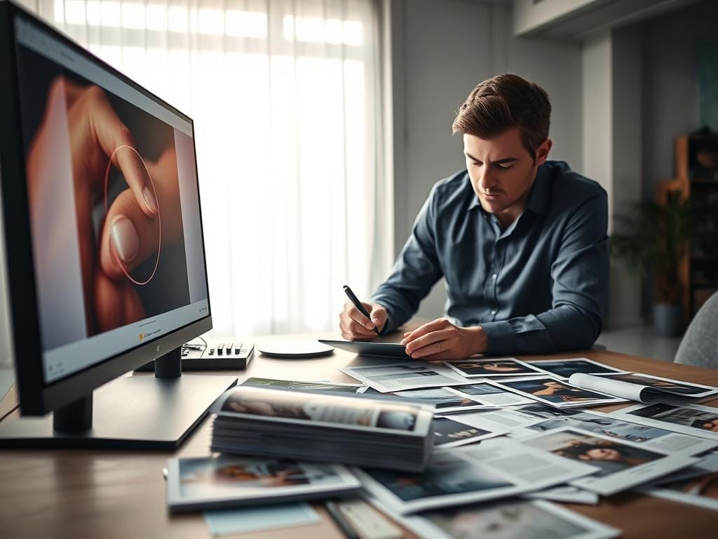
Sharpening workflow: final step before export
First, check the image at its final size. Use tools like Smart Sharpen or Unsharp Mask in Adobe Photoshop for control. Lightroom’s Output Sharpening is good for export, with Standard or High settings and Glossy or Matte choices.
RAW files need both capture and output sharpening. Camera JPEGs have sharpening built-in. Too much sharpening on a JPEG can ruin detail and cause artifacts. If a lab will handle your prints, ask if they sharpen them to avoid double-sharpening.
Different sharpening for glossy, matte, canvas and wood
Glossy papers reflect light, making images look sharp. Use light output sharpening for glossy prints to keep highlights smooth.
Matte surfaces absorb light, softening details. A bit stronger output sharpen can make them look crisp again without harsh edges.
Canvas and wood have texture that can hide fine details. Use gentle sharpening and a smaller radius to avoid making the texture worse. For these media, focus on clarity over sharp edges.
Use this simple table as a starting point for output sharpening choices based on medium and print settings.
| Medium | Tool | Amount (Strength) | Radius |
|---|---|---|---|
| Glossy photo paper | Light Smart Sharpen or Lightroom Output | Low to Medium | 0.5–1.0 px |
| Matte paper | Unsharp Mask or Output Sharpen | Medium | 0.8–1.5 px |
| Canvas | Light Smart Sharpen, lower radius | Low | 0.3–0.8 px |
| Wood or textured board | Minimal sharpening, preview at size | Very low | 0.3–0.6 px |
Always check at 100% zoom and soft-proof when you can. Keep a few test prints for common settings. This helps refine your sharpening and keeps client work consistent.
Preparing client-ready delivery and print education
First, pack files neatly. Give clients JPEGs for keeping and files ready for printing. Name them clearly so clients know what’s for print and web.
Give a simple guide on printing. Explain how to crop and what DPI to use. Tell clients to use labs like Mpix for color accuracy.
Include pictures to show how to crop and sharpen images. Explain how to crop to a ratio, not size. Tell clients to sharpen images based on the paper type.
Guide clients on file formats. Give them JPEGs and TIFFs for high-quality prints. Explain why sRGB is best and show a table of print sizes and qualities.
| Print Size | Recommended Pixels (short side) | Export Quality |
|---|---|---|
| 4 x 6 | 1800 px | JPEG 85–100% |
| 8 x 10 | 2400 px | JPEG 90–100% |
| 11 x 14 | 3300 px | JPEG 95–100% / TIFF |
| 16 x 20 | 4800 px | JPEG 100% / TIFF |
Explain how to get prints. Use a gallery for downloads and offer folders for different sizes. Recommend ordering through your lab for best quality.
Write clear terms for printing. Say prints are for personal use only and you keep the copyright. List any print guarantees and who to contact for issues.
When selling digital packages, include a pricing note. Add fees for lost print revenue and support. This makes pricing clear and helps your business.
End with a checklist for clients. Check previews, choose the right file, pick paper, and use your lab. A good guide helps clients and keeps your reputation strong.
When to offer print fulfillment vs digital-only delivery
Choosing between print and digital delivery changes how clients see you and how much money you make. Some photographers like to pick the paper, color, and finish. They use trusted partners like Miller’s and Mpix for this.
Others just sell high-resolution files and let clients print them. This choice affects how you work, what you charge, and the quality of your prints.
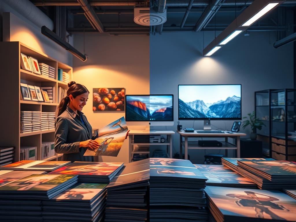
Pros and cons of using lab fulfillment through galleries
Using a gallery or fulfillment service means you get the same results every time. Labs like Miller’s and Mpix keep your images looking great. Clients love the easy ordering process, which makes them happy and likely to tell others.
By using a fulfillment service, you can make a little extra money without raising your prices too much. You don’t have to teach clients about how to prepare their photos for printing. You can also promise certain sizes and finishes when orders go through your lab.
But, setting up this system takes work and you have to manage your margins. You might not have control over the final touches or special sizes. Some photographers don’t promise quality on very large prints made outside their labs because they can vary.
Pricing and business considerations for all-inclusive digital models
All-inclusive digital packages need careful pricing. If you give away files, make sure to include print revenue in your session fees. This keeps your profits safe and prevents you from undercharging for your work.
Offering lab fulfillment at a low markup can be another way to make money without scaring off clients. High-volume, low-margin fulfillment through galleries adds value while staying affordable.
It’s important to have clear business policies. Say which prints you guarantee and which you don’t. Offer premium print services for guaranteed quality on large formats. Teach clients about lab differences and how print ready photo settings help keep your prints consistent.
Preflight checks, printer communication, and final file checklist
Before sending files, use a simple preflight checklist. Make sure pixel dimensions and DPI match the print size. Also, check the color space and file format.
Confirm the color space is sRGB or the lab’s ICC profile. Choose TIFF, high-quality JPEG, or PDF with bleed. Don’t forget to add crop marks or bleed if needed.
Good printer communication is key. Ask the lab to check your files before printing. They might need their ICC profile and a soft-proof in Photoshop.
Confirm if they will add extra color correction or sharpening. Many labs like MPIX, Bay Photo, and WHCC offer preflight reviews. Use them for important jobs.
Schedule proofing for big or important jobs. Compare proofs under the same lighting as your monitor. Label files clearly and give a simple preflight checklist to clients.
Remember, finishes and colors can change between screens and labs. Guarantees only apply when using the specified lab and following their guidelines.
FAQ
What causes images that look great on-screen to print poorly?
What’s the difference between screen PPI and print DPI?
How does viewing distance affect the DPI I need?
Do images from social media work for print?
What pixel dimensions do I need for common print sizes at 300 DPI?
When is it acceptable to use lower DPI for large-format prints?
Why is sRGB recommended for consumer labs?
When should I embed a custom printer ICC profile?
How often should I calibrate my monitor and why?
Which file format should I use for print delivery?
What export settings prevent compression artifacts?
Why should I crop to an aspect ratio instead of a fixed inch size?
How much extra framing space should I leave in a composition?
What’s the correct sharpening workflow for print?
Do different media require different sharpening?
What should I include in a client print guide?
What terms should be in a print release to protect my work?
What are the pros and cons of using a lab versus digital-only delivery?
How should I price prints or digital packages if I offer fulfillment?
What is a practical preflight checklist before sending files to a printer?
How do I work with a printer to reduce problems?
If I must upscale an image, what are realistic expectations?
How do I label and deliver client-ready files to avoid mistakes?
Is it necessary to proof prints before a large run?
What short disclaimer should I give clients about final print results?
Struggling to get consistent photography clients?
Get More Photography Clients