Are you tired of presets that make your photos look fake? They can make skin tones too bright, skies too dark, and everything look flat. Instead, learn a simple way to keep your photos looking natural while saving time.
This section will teach you a quick trick. Think of presets as a starting point, not the final look. You’ll get tips for beginners in Lightroom to avoid fake edits. This way, your photos will look real and consistent for Instagram, portfolios, and client work.
Key Takeaways
- Use presets to set a direction, then adjust exposure, white balance, and HSL for realism.
- Fix technical issues before relying on a preset so colors and skin tones stay believable.
- Pull back global sliders (contrast, clarity, saturation) if a preset looks strong.
- Test presets on a small batch to see how they behave across different lighting and subjects.
- Apply these natural photo editing habits across desktop and mobile Lightroom for consistent results.
Why presets often make photos look overedited and the quick fix
Lightroom presets are meant to save time and set a mood. On Instagram, a preset’s look is judged in a grid. If a preset stands out too much, it can make the photo look overedited.
Signs of overediting include crushed shadows and blown highlights. Also, too much contrast and unnatural colors can be a giveaway. Skin tones that look off or heavy texture can also indicate overediting.
Think of presets as a starting point, not the final edit. Apply a preset to set the mood, then adjust exposure and white balance. Use the tone curve and HSL to fine-tune, and protect skin with masks. This way, the edit supports the image, not overshadows it.
For a quick fix, start by correcting exposure and white balance. Then, dial back sliders like contrast and saturation. Use local masks to protect skin tones. If the edit is too bold, tone it down.
| Problem | What to check first | Immediate slider fixes |
|---|---|---|
| Crushed shadows or blown highlights | Check histogram and raw exposure | Lift shadows, lower highlights, adjust exposure |
| Unnatural skin tones | Verify white balance and HSL Orange/Yellow | Use HSL to reduce orange/yellow saturation, apply skin mask |
| Oversaturated landscape colors | Look at overall saturation and specific HSL channels | Lower global saturation or pull back greens/yellows selectively |
| Harsh texture or halos | Inspect clarity, texture, and sharpening | Reduce clarity/texture, soften sharpening, add subtle grain |
| Preset looks different across images | Compare base exposure, camera profile, and white balance | Adjust exposure, choose correct camera profile, tweak WB |
Understanding what Lightroom presets actually do
Presets are more than a quick fix. They save many adjustments for each photo. Knowing what’s inside a preset helps guess how it will change colors and moods.
Here are the main groups of settings you’ll find. Each one controls something different. This helps you know which sliders to adjust after using a preset.
Saved settings explained: exposure, tone curve, HSL, grading, grain
Exposure, contrast, and shadows set the light balance. The tone curve shapes midtones and can change blacks and highlights. Color is in HSL and Color Mix panels, where you can adjust hues.
Color grading and split toning add creative color shifts. Sharpening and grain change detail and texture. Vignette and basic lens corrections shape the final look.
How camera profiles and base presets set the color foundation
Camera profiles like Adobe Color set the color science. A base profile can change contrast and color before any preset adjustments.
When picking a preset, check the image’s active profile first. Choose a preset that matches the base profile and lighting for better results.
Why one preset behaves differently across images
Every photo has its own light, white balance, and color. These differences affect how a preset works. A preset for soft light might not work well with bright scenes.
Mixed light, high ISO, and clipped highlights also change the result. For beginners, match the preset to the lighting and profile. Then, tweak tone and color as needed.
| Preset Component | What it changes | Quick check after applying |
|---|---|---|
| Exposure & Basic | Overall brightness, white/black limits, contrast | Look for clipped highlights or blocked shadows |
| Tone Curve | Midtone shaping, contrast depth, highlight roll-off | Check skin and highlight detail for crushing or posterization |
| HSL / Color Mix | Hue shifts, saturation control, luminance for specific colors | Verify skin tones, skies, and foliage for natural balance |
| Color Grading | Split tones in shadows, midtones, highlights; global tint | Ensure grading doesn’t push colors into unnatural ranges |
| Sharpening & Grain | Perceived detail and film texture | Reduce grain on high ISO images; avoid over-sharpening faces |
| Camera Profile / Base Preset | Foundational color response and contrast | Match preset style to base profile for consistent results |
Lightroom presets without overediting
Presets can make your photos look great fast. But, use them as a starting point, not the end. A good preset should help with color and tone, but let you fix details yourself.
Defining “no overediting” for portraits, products, and landscapes
For portraits, keep skin tones nice and catchlights clear. Use gentle contrast. Make sure skin looks real and colors are natural.
For product shots, aim for perfect color and texture. Whites should be clean. Shoppers want to see the real thing.
Landscapes and travel photos should have believable skies and colors. Keep highlights and shadows right. Avoid too much saturation that distracts from the scene.
Working rule: direction first, believability second
First, use a preset for mood or contrast. Then, adjust exposure and white balance. This keeps your photo real.
Think of presets as a compass. They guide you, but you adjust to keep the photo believable.
How to judge if a preset is too strong
A preset is too strong if it hides the subject. Watch for wrong skin tones, blown highlights, or too bright colors. These are bad signs.
Check indoor and mixed-light photos for yellow casts or muddy shadows. Use HSL tweaks and masking to fix these without losing the preset’s feel.
Practice with different images and adjust sliders as needed. Save your changes to keep your edits natural and consistent.
Prepare your photo before applying any preset
Getting the basics right makes presets work better. Start by fixing exposure and white balance. This way, the preset can change tone and color smoothly.
Clean up your photo’s composition and lens corrections. This makes batch editing easier, whether for Instagram or client galleries.
Exposure and ETTR basics so presets behave predictably
Make sure your exposure is set before using a style preset. If you shoot RAW, use exposure ETTR in-camera. This helps reduce noise and keeps shadow details.
In Lightroom, adjust exposure to a natural level. Then, recover highlights and open shadows.
Presets don’t work well on underexposed or clipped photos. Make basic fixes first. This way, Lightroom presets work the same on a batch.
White balance first: neutral targets vs. mood choices
Fix white balance in Lightroom early on. Use a neutral target like white trim or paper. This sets accurate skin tones and product colors.
For mixed lighting, use local masks. This keeps natural skin while keeping ambient warmth.
After setting neutral balance, you can change mood. Adjust temperature and tint only after the technical part is done. This keeps creative choices consistent.
Crop, lens corrections, and removing obvious distractions
Crop your photo for the final look before presets. This keeps batch edits consistent, like for an Instagram grid. Also, turn on lens profile corrections and remove chromatic aberration.
Remove obvious distractions and spot-heal sensor dust next. A clean photo lets the preset change the mood without flaws.
Safe preset workflow that keeps photos natural
Start with a clear process that moves fast but stays consistent. A safe preset workflow helps you keep a unified look across a shoot. It also gives you control to reduce overediting.
Instagram shoots and client batches demand speed. Yet, small checks prevent a mismatched gallery.
Follow a simple order: prepare, apply, repair, and refine. Prepare means exposure, white balance, and crop so presets behave predictably. Apply the preset only as a visual direction.
Repair technical issues next, such as blown highlights or skin tone shifts. Finish by dialing back aggressive settings. This prevents overediting.
Use targeted pulls to preserve mood without losing realism. Reduce the damage by pulling back Contrast, Clarity, Texture, Dehaze, and overall Saturation when needed. Focus on Reds, Oranges, and Greens in the HSL panel to tame skin and foliage.
Small reductions keep the preset’s intent while restoring authenticity.
When your system offers an Amount or Opacity control, use it to scale the preset’s strength. If Lightroom’s Profile/Amount slider is available, lower it until the image reads natural. Apply graduated and radial filters or color and subject masks to protect faces while cooling backgrounds or lowering yellow saturation.
For indoor portraits, protect skin texture with subject masks. Add moderate Texture (+5 to +10) inside the mask, then reduce Yellow Saturation and raise Yellow Luminance to avoid brassy tones. This keeps tonal detail in skin while you reduce the global impact of the preset.
| Step | Action | Typical Sliders to Adjust |
|---|---|---|
| 1. Prepare | Set exposure, white balance, crop, and lens corrections | Exposure, WB, Crop, Lens Correction |
| 2. Apply | Load preset as a starting look, evaluate direction | Profile Amount/Opacity (if available) |
| 3. Repair | Fix highlights, shadows, and skin tones locally | Highlights, Shadows, Whites, Blacks, Targeted HSL |
| 4. Reduce | Soften aggressive settings to reduce overediting while keeping mood | Contrast, Clarity, Texture, Dehaze, Saturation/Vibrance, Tone Curve |
| 5. Localize | Use masks for targeted corrections and final polish | Radial/Graduated Filters, Color/Subject Masks, Brush |
| 6. Export | Choose settings per platform to preserve look in output | Output Sharpening, File Type, Resize, Color Space |
Presets and different photo types: tailored checks
Presets make editing faster for Instagram, client galleries, or product catalogs. Try presets on mobile and in grid view. This shows how colors look at small sizes.
Choose a preset that matches your photo’s style. A cozy indoor look is good for lifestyle shots. A bright clean preset works well for product photos.
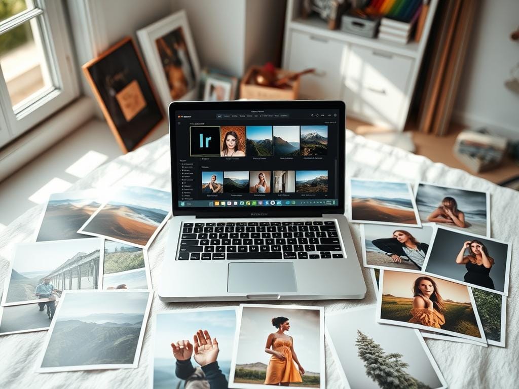
For portraits and lifestyle photos, check them closely after applying a preset. Use Subject Masking to protect faces. Make finer adjustments where needed.
Check skin tone, eye catchlights, and shadow softness. If skin looks too bright, reduce orange and yellow in the HSL panel. This keeps skin tones natural.
Food and travel photos need to look appealing and set the mood. Avoid presets that make colors too cool or warm. Check yellow and orange for food, and blue and green for skies and foliage.
Use the Tone Curve to add contrast without losing sky highlights. This makes images look better on mobile.
For product and ecommerce photos, color and texture are key. Use calibrated profiles and test swatches for color accuracy. Keep grain low and sharpening controlled to show surface details.
White backgrounds should be neutral. Use local masks to fix any color cast from presets. This keeps colors accurate.
Modern presets have an Amount or Opacity control for quick adjustments. Start with a low preset and then fine-tune with HSL masks or local edits. This way, you avoid losing image quality.
| Photo Type | Main Checks | Key Tools | Preset Safety Tip |
|---|---|---|---|
| Portraits & Lifestyle | Skin tone accuracy, eye catchlight, shadow softness | Subject Mask, HSL (Orange/Yellow), Brush | Lower Amount; protect faces with masks |
| Food & Travel | Appetizing color, natural skies, unclipped highlights | Tone Curve, HSL (Yellows/Oranges/Blues), Graduated Filter | Check mobile grid; balance warmth and saturation |
| Product & Ecommerce | Color accuracy, texture, neutral backgrounds | Calibrated Profiles, White Balance Eyedropper, Local Mask | Compare to swatches; keep grain low for ecommerce color accuracy |
Practical adjustments to avoid an overedited look
Start with a light touch. Open the image at 100% to check details. Make small changes and compare to the original. Step back before you finish.
Use the tone curve Lightroom panel to add depth. Make a gentle S-curve: lift shadows, pull midtones, and avoid steep drops. Recover highlights a bit to keep bright areas detailed.
Adjust in small steps to avoid losing texture. HSL color mix tips help keep skin and colors natural. Lower Yellow Saturation by 10–25 to reduce indoor warmth.
Adjust Orange Hue +2 to +8 and lower Orange Saturation by 5–12. This keeps skin tones natural. Fix Reds or Greens one at a time to avoid losing color.
Use Luminance to brighten without adding brassiness. Clarity, Texture, sharpening, and grain need careful use. Add Texture and Clarity in the +5 to +15 range for detail.
Avoid high clarity on faces to avoid highlighting pores. For low-light, start with Luminance noise reduction 15–25, Sharpening 40–60, and Masking 50–80. This keeps edges sharp and protects smooth areas.
Apply grain sparingly; 5–15 adds an organic feel. When sharpening, use Masking to limit effect to edges. Zoom to 100% and flip the edit to check if it enhances, not overprocesses.
Building a shoot-specific preset routine and testing
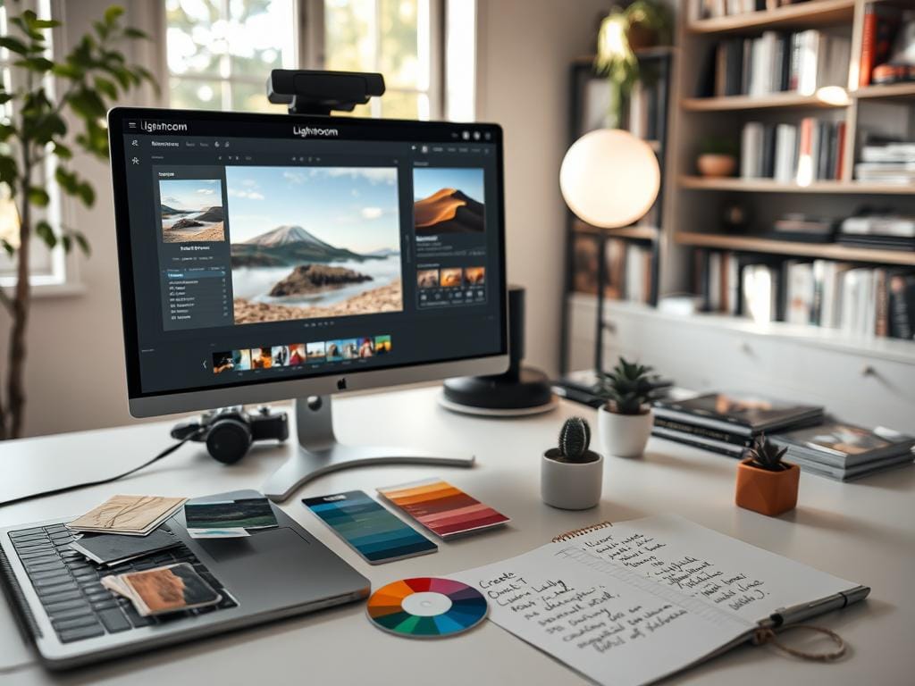
Plan each shoot carefully to keep your editing workflow smooth. Make a quick checklist for lighting, colors, and where you’ll share your photos. This helps when editing many photos at once.
How to test on a small batch to check flexibility
Choose 3–5 images that show the shoot’s range. One should be bright, one dark, and include close-ups and wide shots. Start by adjusting exposure and white balance.
Then, apply your preset and tweak as needed. Export low-res versions for quick checks on any device.
Saving your adjusted version as a custom preset for the shoot
If your adjustments look good on the test images, save them as a custom preset. Name it with the shoot date and a brief description. This way, you can easily apply the same look to more photos without overdoing it.
Export settings for web, social, and print to preserve natural look
Set your export options based on where your photos will be seen. For web and social, use JPEG, sRGB, and a long edge of 2048 to 3000 px. For print, export at full size, 300 ppi, and in the correct color space.
Batch tips and final checks
When batching, use less preset Amount or Opacity for varied images. Check skin tones and product colors after exporting. For indoor shots, keep white balance right and add vignette or grain if it fits the mood.
When presets aren’t enough and how to finish images professionally
Instagram and client campaigns need more than a simple preset. Use Lightroom masks and color-range adjustments to fix skin tones and brighten eyes. For tough spots, export to Photoshop for detailed work.
Professional finishing means checking color and print readiness. For ads or product pages, check on a calibrated monitor. Soft-proof for specific paper profiles and compare with swatches for color accuracy.
Indoor and low-light shots need careful handling. Start with Luminance noise reduction at 15–25. Sharpen in the 40–60 range with masking. Add subtle grain to unite texture.
Presets are just the start. If a preset messes up the background, adjust strength and fix exposure first. Protect skin tones. Use presets to speed up, then add your touch for believable images. Learn more at Lightroom tips to edit faster.
FAQ
Why do presets often make photos look overedited and what’s the quick fix?
What are common signs that a preset has overedited an image?
Aren’t presets the final edit? Why are they only a starting point?
What do Lightroom presets actually change under the hood?
How do camera profiles and base presets affect a preset’s result?
Why does one preset behave differently across images from the same shoot?
How do you define “no overediting” for portraits, products, and landscapes?
What’s the working rule to keep presets natural while maintaining a mood?
How can I tell if a preset is too strong?
What should I do before applying any preset?
How does ETTR and exposure prep help presets behave better?
White balance—should I choose a neutral target or a mood first?
Which sliders should I pull back if a preset looks too aggressive?
Does Lightroom have a global Amount/Opacity control for presets?
How do I protect skin tones when using presets, specially indoors?
What tone curve approach avoids a crushed or over-contrasty look?
HSL/Color Mix practical tips to avoid brassy indoor tones?
How should I handle clarity, texture, sharpening, and grain?
What is a safe workflow to batch-apply presets while keeping images natural?
How do I test a preset across a shoot before committing to it?
What export settings preserve a natural look for web and social?
When should I move beyond presets and use Photoshop or advanced retouching?
Any final practical rule to rescue an overedited preset?
Struggling to get consistent photography clients?
Get More Photography Clients